Oil pastel art is so versatile and the end product looks amazing, We have some stunning art in this post to help you get inspired. If you’ve got a set of oil pastels sitting in a drawer (or you’re thinking about picking some up), this is your sign to get stuck in.
Oil pastels are brilliant for beginner artists as they’re forgiving, mess-free compared to paint, and don’t require loads of art supplies to get started.
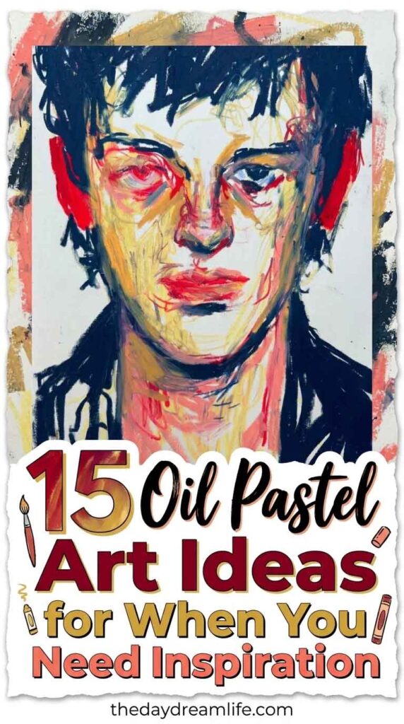
You could have a quick session that you can simply finish in ten minutes or a project to really sink your teeth into.
In this post, I’m sharing 15 oil pastel art ideas to inspire your next creative session — from easy doodles to more detailed pieces, there’s something for every mood and skill level.
Grab your pastels and let’s get creating!
Number One
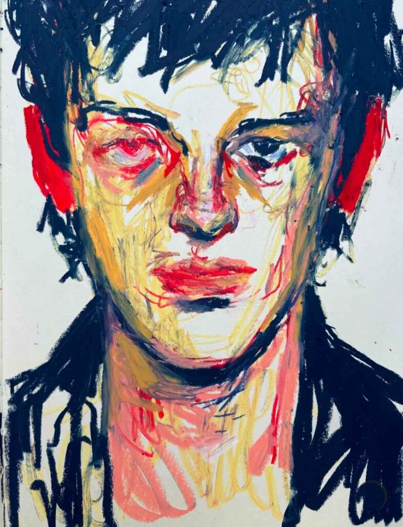
Starting off strong with this striking portrait; it uses bold unblended oil pastel — deep indigo hair, punchy red accents, and warm ochre skin tones.
The loose, sketchy marks and visible underdrawing give it raw, expressive energy rather than smooth realism, showing how much mood you can capture with colour alone.
Source: avgust.point
Number Two
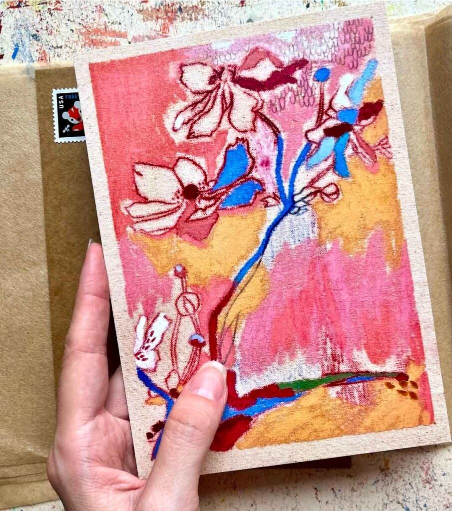
This is an abstract yet vibrant floral piece with pink color blocks as a backdrop for bold for the linear flowers.
The layered colour blocking behind the blossoms adds real depth, while the confident outlines keep the flowers feeling fresh and painterly rather than overworked. It shows that oil pastel art can be interpreted in any way possible, even abstract!
Source: natasa_kekanovic_art
Number Three
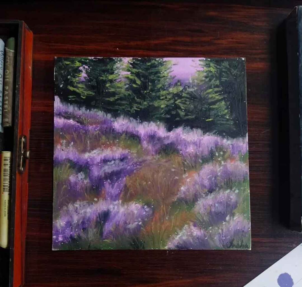
A dreamy landscape of blooming lavender heather set against dark pine trees, with soft dabs of white capturing light dancing across the field.
Rich purples blend into mossy greens and warm rust tones in the foreground, while the deep, layered greens of the treeline add real dimension. Oil pastels can build real atmosphere and depth in a natural yet realist way.
Source: in_.shalune
Number Four
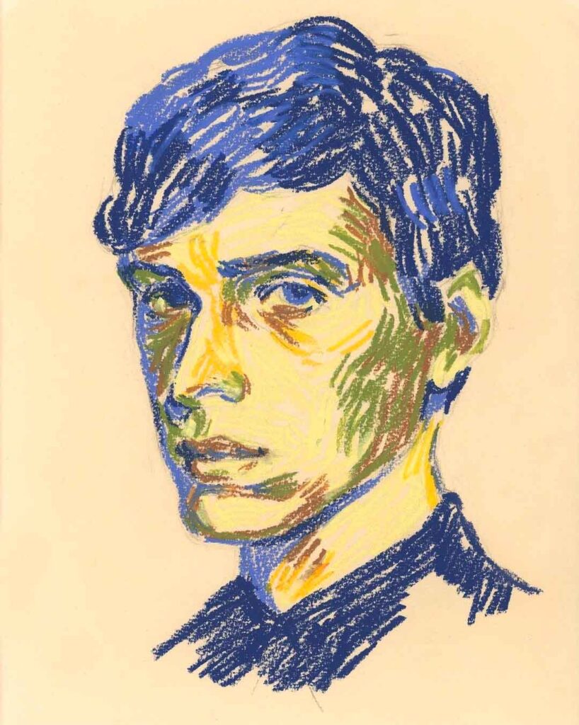
Another beautiful portrait which is built entirely from unnatural colour — blues and greens all set against soft cream paper.
This piece is created on directional strokes and yet it has such realism to the portrait. Using a limited color palette can help the artist focus on the actual piece and technique of the artwork rather then worrying about colors.
Source: viktoriamaliar
Number Five
I love a juicy textured still life! This jar of peonies is worked straight onto warm kraft paper that peeks through as its own colour.
Thick, chunky strokes of pink and white build up the blooms giving the piece real dimension. While a loose blue background makes the flowers pop without any hard edges to fuss over. — oil pastels are great for for loose, expressive florals.

Source: hannahdurhamillustration
Number Six
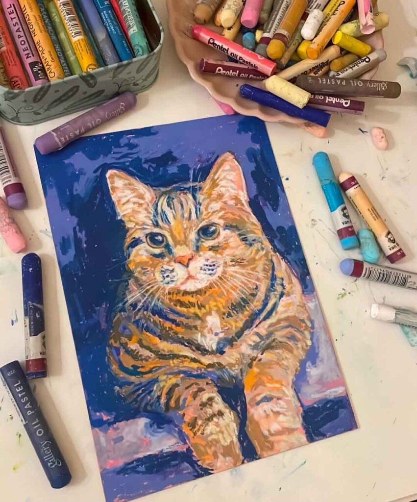
This playful ginger tabby portrait has such depth! The colors pop against a deep indigo background, with warm oranges and browns layered in confident, striped strokes to capture that classic tabby pattern.
The bright white whiskers and glossy eyes add real character, while the contrast between the cool background and warm fur makes the whole piece feel vivid and alive.
Source: helsemimma
Number Seven
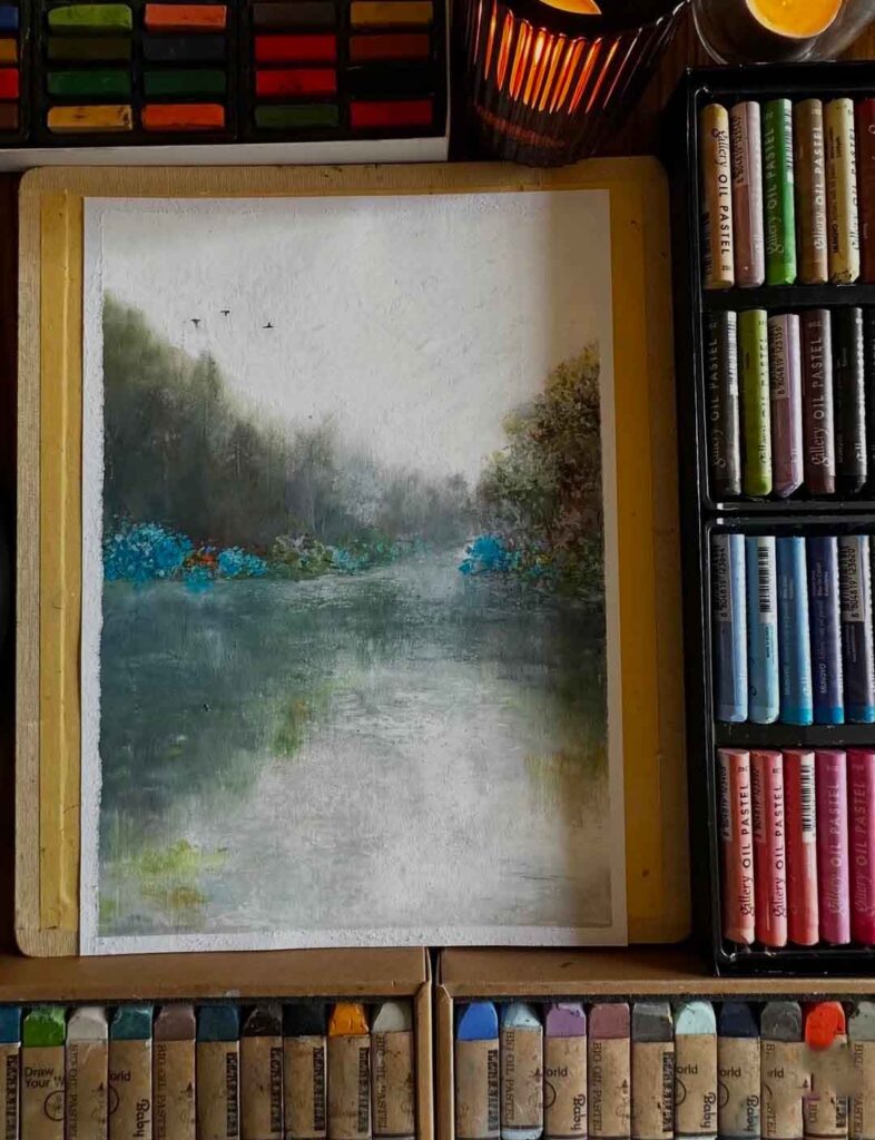
Such an atmospheric and stunning piece. The artist has created a misty riverside scene created in hazy greys and greens capture that quiet, damp-air feeling of an overcast day.
Pops of teal-blue foliage along the banks break up the muted palette, while distant birds add a touch of life to the stillness. An artwork full of depth giving a very peaceful feel.
Source: yanagi_oilpastel_
Number Eight
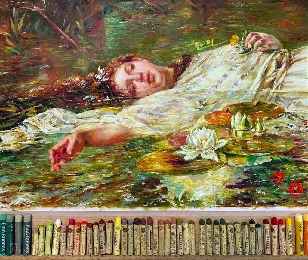
This piece looks like a study of a classical painting, reimagined in oil pastel — a striking choice given how unforgiving the medium can be for fine detail and soft blending.
The delicate skin tones, intricate lace, and layered water lilies show impressive control, proving oil pastels can hold their own against oil paint for capturing realism and quiet detail.
Source: danhartstudio
Number Nine
From bold detailed to an abstract bold piece. A lush, full basket of red roses created in thick, blocky strokes that give the piece real weight and texture.
The mix of true reds, dusky pinks, and soft blush tones keeps the bouquet from feeling one-note, while dense clusters of colour captures a sense of abundance. Using layered chunky marks is a great way to build volume without any fine linework at all.
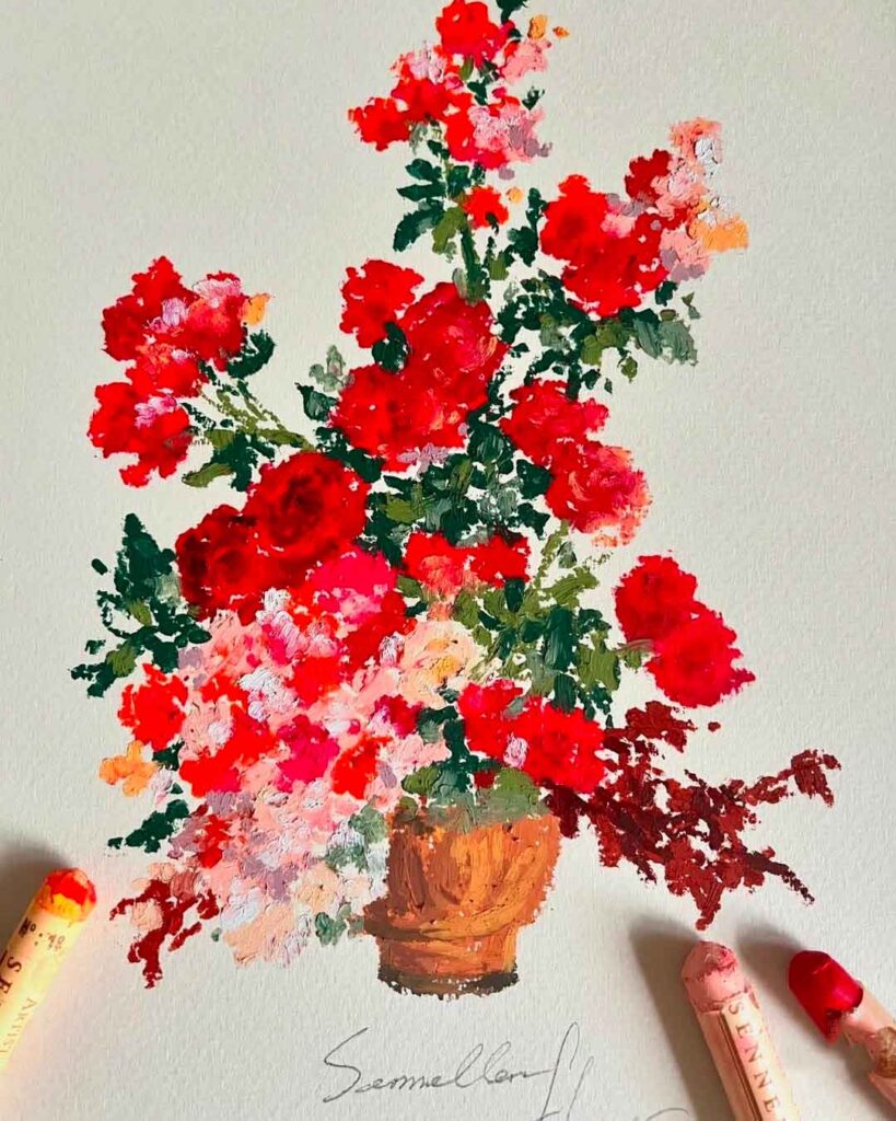
Source: lemon_tree.studio
Number Ten
A wintry woodland scene bathed in unexpected colour, with icy blues offset by warm flashes of orange, pink, and yellow catching the light through the trees.
Rather than sticking to a realistic snow palette, the artist leans into colour temperature to create atmosphere and glow, making a quiet winter scene feel electric and full of warmth.

Source: elenavocat_
Number Eleven
This wildflower bouquet really sings against its navy paper, with coral, purple, and golden blooms scattered in loose, dabbed marks that feel spontaneous rather than composed.
The dark background does a lot of the work here, making every colour punch through with extra vibrancy, while scribbled linework hints at stems and grasses without needing to capture them fully. It just shows that working on coloured paper can do half the job for you.
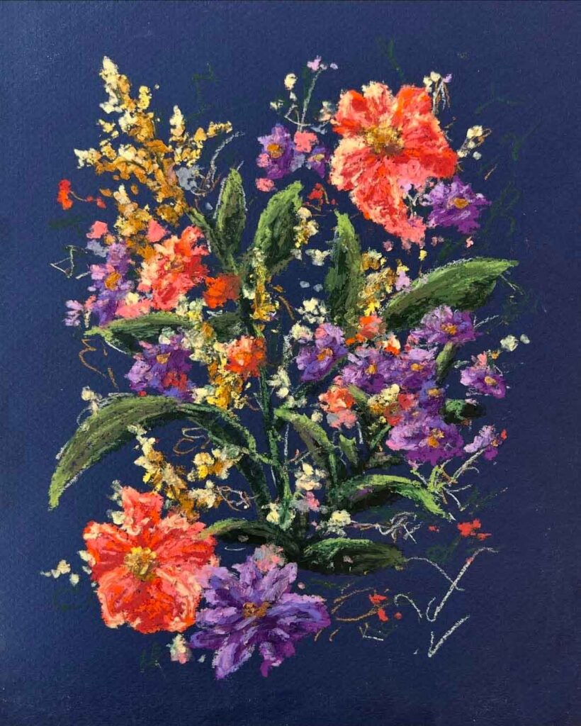
Source: ricki_lee_scheef
Number Twelve
A pair of cherries painted with surprising rainbow flair, using unexpected flecks of purple, blue, and yellow within the reds to build dimension rather than sticking to a realistic palette.
Set against crisp white paper with a simple sky-blue border, the graphic simplicity of the composition lets the wildly textured, jewel-like colour work take centre stage — proof that “realistic” and “expected colour” aren’t the same thing.
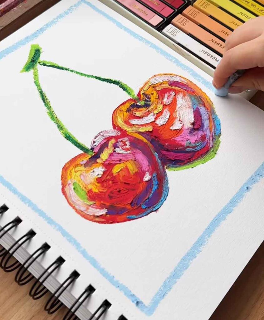
Source: malilianmengfei7
Number Thirteen
Such a stunning study inspired by Monet’s water lily paintings, translated into oil pastel’s chunky, textured strokes.
Layers of blue-green pond water dotted with soft pink blooms sit beneath the pale wooden bridge, with dense, directional marks capturing that impressionistic feel.

Source: ______dale______
Number Fourteen
Two dreamy floral pieces caught mid-blend, where soft creams, pale pinks, and blues melt into a moody, dark backdrop.
The heavily smudged, hazy quality gives these a nostalgic, almost hand-tinted photograph feel. This is a lovely example of how far you can push blending in oil pastel to soften a busy bouquet into something more atmospheric and painterly.
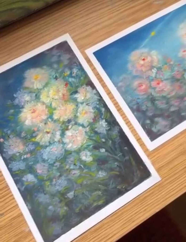
Source: vinaadorelife
Number Fifteen
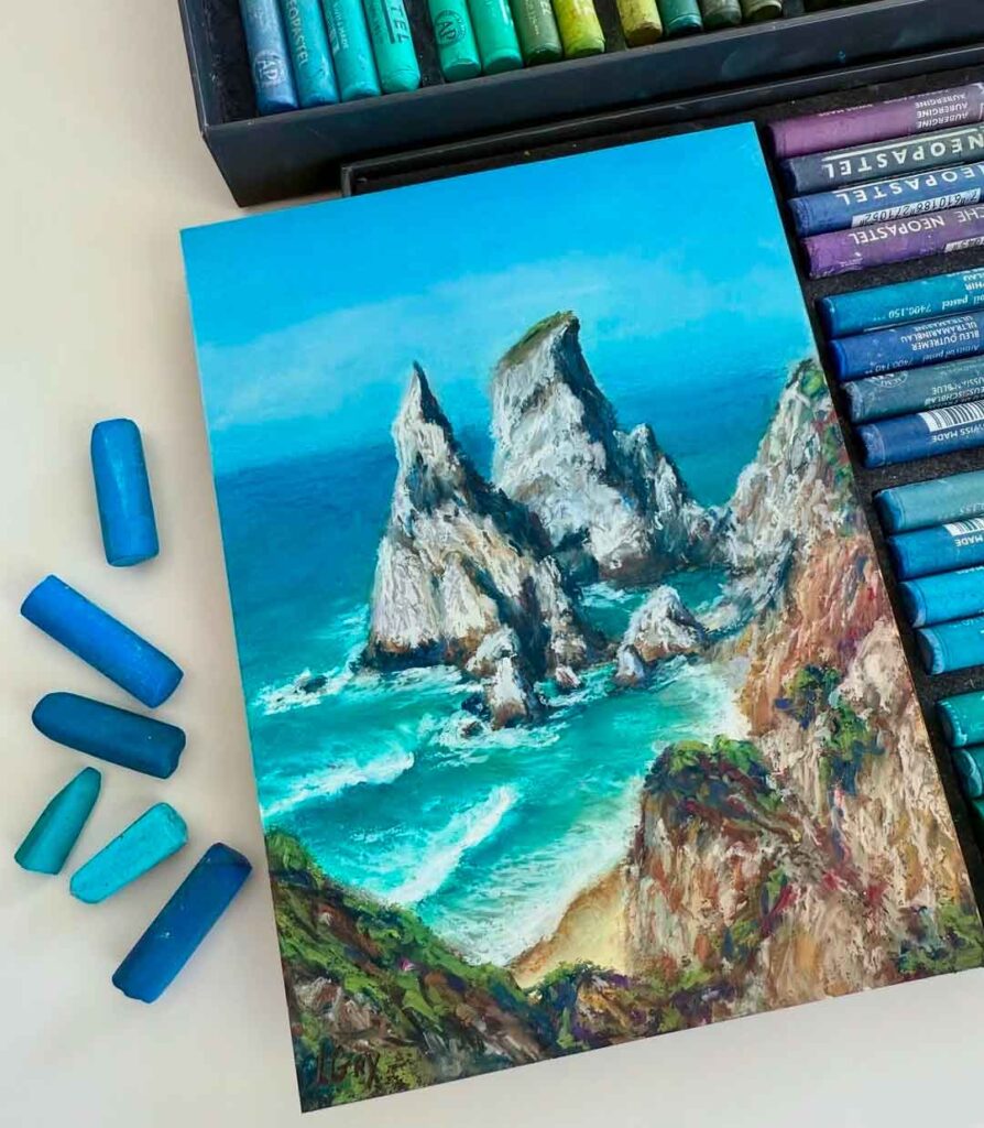
A dramatic coastal scene with jagged white sea stacks rising out of vivid turquoise water, showing just how vibrant and saturated oil pastel colour can get.
The crisp contrast between the sharp, sunlit rock faces and the frothy white surf demonstrates real control over light and texture, while the layered cliffside in the foreground adds scale and grounds the whole composition.
Source: inna.gry
And there you have it — 15 oil pastel ideas spanning everything from bold, expressive portraits to soft, blended landscapes and everything in between.
Hopefully this has shown just how versatile oil pastels really are — they can go loose and painterly one minute, then hold fine detail and realism the next, all depending on how you use them.
If you liked this post, be sure to check out our other artsy posts below:
Mixed Media Collage Art: Easy Flowers


Leave a Reply