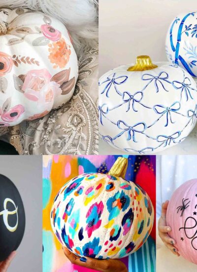
My blue tone watercolour printable art print set!
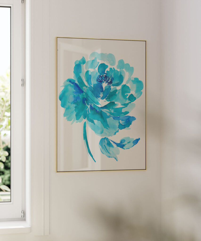
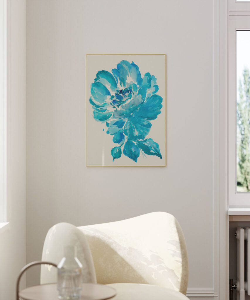
I love painting big loose watercolour florals and this time I decided to go for blue tones! Blue tones are always trendy, and catching to the eye. I painted these in my studio at the back of my garden and decided they would make lovely prints.

Save these images on Pinterest!
These prints would make a lovely statement piece in any home, I think even if the surrounding area had a lot of colour or not much colour, they would still look great. It would create a warm and inviting atmosphere in your home and add a personal touch to your décor. Blue tones, in particular, evoke a sense of serenity, evoking images of calm waters, serene skies, and delicate blossoms. These stunning artworks can transform any space and bring a touch of elegance and tranquillity to your surroundings.
Save these images on Pinterest!
The unique signature of watercolour florals is the vastness of its versatility. Watercolour florals can be very bold or delicate, depending on how the artist has chosen to use their medium. I like to put a lot of water in mine so that the inks blend nicely with each other and it creates a translucent and ethereal affect.
One of the reasons I like printable art is because it’s a cheaper alternative to more expensive one-off editions which has to be purchased. I have made my prints high resolution with 300dpi (which basically means it’s the highest quality and won’t be pixelated when printed).
My prints can be downsized or upscaled by personal preferences because of the quality of the image. If you want a larger piece for your home, say; A1 size, then that can simply be done by getting the image enlarged. If you are getting the printable professionally printed, I’m sure most companies won’t mind upscaling the image for you. I have attached sizes A4 and A3, these are standard international sizes which can be printed at home.
Most printers can downscale the size of the image itself in the printing options, but if you have a printer that prints A3, then that’s an option too.
Which papers to use is also important to the quality of the print. The weight of the paper makes a huge difference to the outcome of the print and personally I wouldn’t use a paper thinner then 200gsm, otherwise it wouldn’t give the print justice and give it a paper feel which is not what we want here.
The texture of the paper also matters on what the finished print will look like, my personal preference is a matte finish. Glossy paper is usually good for photography. Or is you really want to go fancy and give a real watercolour look then there are many thick heavy weight watercolour papers to choose from which your service provider can help you with.
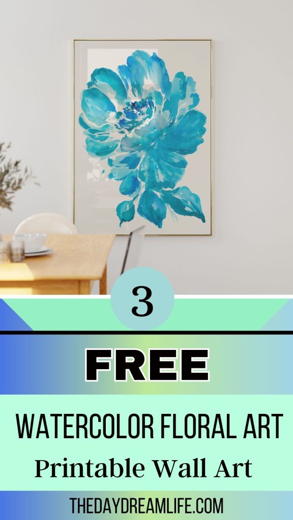
Please not: on the peonies paintings, I have made the background colour OFF WHITE to replicate the colour of the watercolour paper I was using when painting. It looked odd on white background, this was just my personal preference.

Save these images on Pinterest!
Now time for the good stuff, your free download! Click on the link below for your free printables!
The downloaded is a zip file. To unzip a zip file, all you have to do after downloading is double click on it and it should extract the folder to a normal folder with the printables in. The size of the printables are A4 & A3.
Disclaimer: These prints are for PERSONAL use only, please do not sell them on any website.
If you liked these printables, please follow me on pinterest and share my posts, it helps me to continue making free art!